Graphics Update to Improve Battle Legibility

In this update, I made a few changes to make battles more legible:
1) Changed the colour of attacks. Poke is white, Extend is blue, Stab is red, Swipe is yellow. This is to make it easier to tell which attack is used.
2) Bees squish when hit, to make it more visible when they're in hitstun. This is something I got from Sakurai's video on Squashing and Scaling. The other graphical flair in bee coach - having a brief stop and screenshake when one bee hits another - is something I got from his video on hitstops.
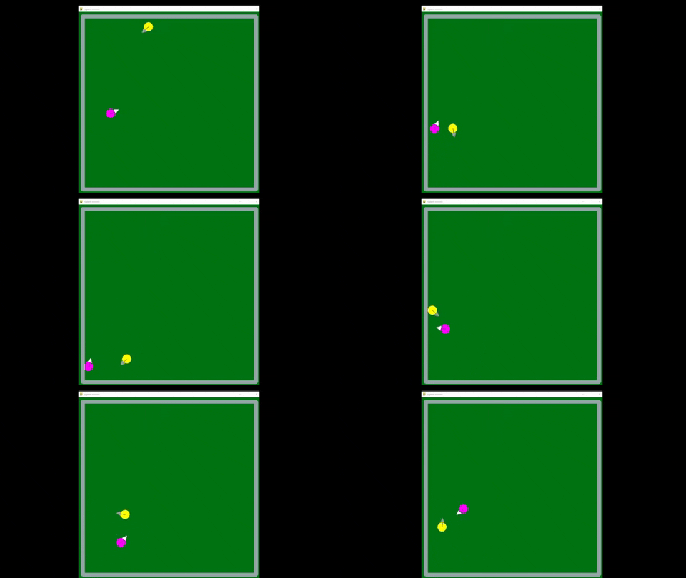
Obviously bee coach's graphics are, uh, a bit rough; but they could be so much worse! Here's the predecessor to bee coach:

The "bees" actually hit each other multiple times in this gif but it's basically impossible to tell. Bee Coach's graphics have a long way to go, but at least now you can tell when the bees hit each other!
Bee Coach
Coach a bee!
| Status | Prototype |
| Author | 307th |
| Genre | Strategy |
| Tags | ai, auto-battler, bee, Monsters, monster-taming |
More posts
- August 22nd UpdateAug 22, 2023
- August 4th UpdateAug 04, 2023
- July 26th Update: Stat Bars!Jul 26, 2023
- July 24th UpdateJul 24, 2023
- July 23rd UpdateJul 23, 2023
- July 22nd UpdateJul 22, 2023
- July 21st UpdateJul 21, 2023
- Adding SkillsJul 20, 2023
- May 19 updateMay 19, 2023
Comments
Log in with itch.io to leave a comment.
It is very cool to see the predecessor video. I'm glad you've kept it as a record of how far the AI has come.